Thoughts on Architecture from a Collection of Small Illustrations | Junya Ishigami Lecture - Part 1
Thoughts on Architecture From Small Clusters of Illustrations
Junya Ishigami Lecture, Part 1
INAX Publishing's series, 'Contemporary Architects' Concepts,' compiles the architectural practices of emerging architects into single volumes. Following the first installment featuring Sou Fujimoto, the second, scheduled for release on September 5th, will showcase the concept book of architect Junya Ishigami, who is currently garnering attention for his participation in the 11th Venice Architecture Biennale.
To coincide with the release of this concept book, we present excerpts from Junya Ishigami's lecture "About My Own Work," held recently at INAX:GINZA and organized by the Architectural Forum. This installment focuses on two of his table works and his spatial design projects.
Compiled and written by Takashi KatoIn cooperation with Architectural Forum and INAX Publishing
Tables for Restaurants
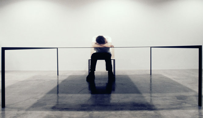
The commission was for the interior of a restaurant. The client's request was to serve approximately five groups of customers, each in a special space. The area was about 50 square meters, not large enough to create individual rooms by partitioning the space. Therefore, instead of dividing the space with walls, we decided to provide tables that were almost too large for two people. While not as rigid a boundary as a wall, a table allows for a certain recognition of one's own space. We thought this could create a gentle separation of the space.
What I considered first in this project was not to create the space by applying finishes like plastering or painting walls and floors, as is typical for interior projects, but to think about it in a more architectural way.
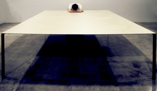
I wanted to create these tables as small architectures that would gently partition the space. The tables measure 2m x 2m, taking up considerable room. Therefore, adjusting their presence was crucial. Specifically, I thought a large table, thin like paper, would be ideal. Although made of steel, it's so thin that if designed normally, it would sag. Thus, in collaboration with a structural engineer, just as in architecture, we performed structural analysis. By calculating the locations and degrees of sagging, and the curvature in advance, and pre-bending the material in the opposite direction of the intended sag, we ensured that the tabletop and legs would be horizontal and vertical when installed on the floor.
We planned the tables within the restaurant space as if placing five small buildings on a site, treating the restaurant's interior as the site itself.
I always felt that tables, within interior design, were quite close to architecture. This is because the tabletop can be seen as a roof, and the legs as columns, giving them an impression close to the archetypes of architecture.
The surfaces of the tabletop and legs are finished with veneer. While the actual material is steel, at first glance, it's unclear what it's made of. It might look like plywood. The structure is also ambiguous. I wanted to create something like that. I believed that such ambiguity would contribute to the comfort of the space. I thought that objects whose nature is unclear would have less defined boundaries, making it ambiguous where they begin and end as self-contained entities, and where they depend on something else. This ambiguity, I felt, would ultimately broaden the flexibility of the design.
Being large tables, plants are placed on most of their surface, treating them as small gardens where diners can eat while gazing at them. When many dishes are ordered, plants are placed underneath the table, and sometimes people chat while placing their belongings on the table.
Viewed from the side, the tables appear to have no thickness, giving the impression of a drawing rendered in space. By creating tables that seem to be there and not there, I intended for them to transcend their status as products and become the space itself. In doing so, I believed the tables could become something that could be called architecture.
Kirin Art Project 2005 "table"
Next is a large table work developed from the restaurant tables. This was created for an exhibition in a gallery.
Initially, I considered exhibiting the "Tables for Restaurants," but I felt a certain awkwardness in placing objects designed for a restaurant's function within a gallery exhibition space. I believed this awkwardness could not be resolved unless I conceived of a new table specifically for this space.
When I considered what it means to create a table in a gallery exhibition space, I thought that, unlike a restaurant, there would be no cutting meat or resting elbows, nor would there be writing or meetings. However, this doesn't mean the table's function is unnecessary; I felt it must retain a minimum functionality as a table. In a gallery, people are likely to be observing things placed upon it. I thought it would be best if the act of observation and the table's function were linked by a subtle relationship.
Plants, tableware, and tea sets arranged like a landscape. The image is of them floating on the surface of water. I imagined being able to drink tea from a tea caddy floating on the water, while gazing at the scenery created by still lifes drifting and gently oscillating on the water's surface.
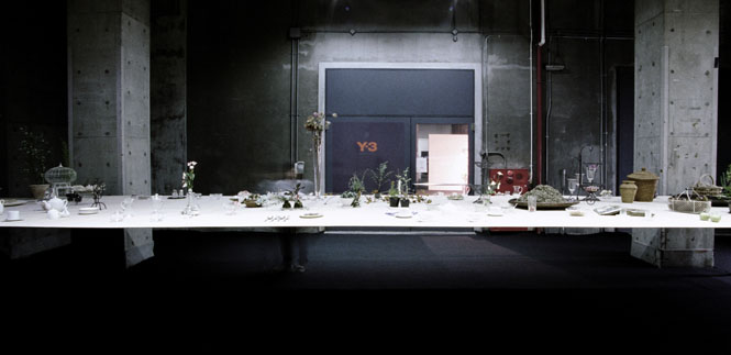
The table is 9.5m long, slightly higher than a normal table at 1.1m, and 2.6m wide. It is made of aluminum, and rather than being rigid like restaurant tables, I wanted to create something extremely soft, like paper. This paper-like, very soft table would begin to oscillate gently, like ripples spreading on water, with the slightest touch. The large table would sway softly like a water surface.
While the "Tables for Restaurants" stood solely under their own weight, for this table, we designed the space anticipating what would be placed on it. The structure was calculated to include the weight of the objects placed on top. Since it was designed to support the load of the items placed on it, during setup, instead of placing the objects immediately, we used PET bottles filled with water to balance the anticipated weight, gradually replacing them with the exhibition items.
The table weighs 700 kilograms, a considerable weight. This very heavy object gently undulates, like wind disturbing a water surface. It sways with an amplitude that doesn't cause the objects on top to fall. This slow, almost illusory, gentle sway creates an ambiguity where it's hard to discern whether the space is moving or the table is moving. Once it starts swaying, its period is extremely long, continuing to move slowly for an hour or two without stopping.
We created a large table in the gallery, like a water surface. I envisioned people slowly drinking tea there.
LEXUS Venue Design
Toyota's Lexus, in preparation for its global rollout, commissioned us to create an installation and presentation event within an old theater in Milan during Milan Design Week.
The space itself was an old theater of about 1500 square meters, and due to the event's nature, there was a condition that setup must be completed within two days.
My considerations were how to construct such a large space in a short period and how to exhibit the cars within the theater.
I have always felt a certain dissonance with cars being exhibited indoors in showrooms or similar venues. For me, forcefully placing objects of an outdoor scale indoors felt very awkward. How to resolve this difference in scale within this space became a major theme. Therefore, I decided to transform the entire theater into a landscape.
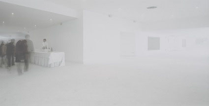
I believed that by creating the space in a manner akin to landscape design, the original venue would naturally accommodate an outdoor sense of scale. Specifically, by filling the entire theater with mist, the space would change moment by moment, like shifting weather. At times it would be very cloudy, and at other times, as customers entered and the temperature rose, the saturated vapor content would increase, causing the mist to gradually dissipate. This would then reveal the original theater's scenery.
The space transformed throughout the day; when it became foggy, the theater's seating, covered in white fabric, appeared like snow-capped mountains. As it grew foggier, the depth of the space became entirely indiscernible, creating a pure white void. Then, the original theater would faintly emerge. Like mountain weather, the theater's scenery changed throughout the day. Rather than a fixed interior space, it became a space with a fluid, natural flow.

Contemporary Architects' Concepts Series 2: Junya Ishigami
Thoughts on Architecture From Small Clusters of Illustrations
Authors: Junya Ishigami, Taro Igarashi, et al.
Published by: INAX Publishing http://www.inax.co.jp/publish/
Format: 210mm x 150mm
Pages: 160 pages (all color)
Price: 1,890 yen
Published: September 5, 2008
For more detailed information on Junya Ishigami, click here.
http://openers.jp/interior_exterior/index/junya_ishigami.html