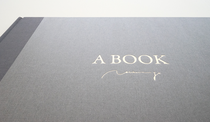
A BOOK: An art book that feels like a picture book | ART
ART | The World of Art Label "Works & Words" Condensed
A Unique "Book as Artwork" Connecting Art and Audience
Designer Go Narisawa's art activity label "Works & Words" has created "A BOOK," an art book adopting a picture book style. The story, woven with simple words, gently permeates the heart, complemented by prints rendered in soft paper lithography.
Text by Kosaku WASEDA (OPENERS)
Theme: "Quiet Voices"
"Works & Words" is an art activity label by Go Narisawa, representative of the design company "Nakayoshi Zukousitsu." The label presents works that express the subtle joys found in fleeting moments of everyday life.
"A BOOK" takes the expressive methods, motifs, and worldview of works previously released under "Works & Words," while also exploring a new theme. It is an innovative approach that combines pictures and words, unfolding "like a picture book."
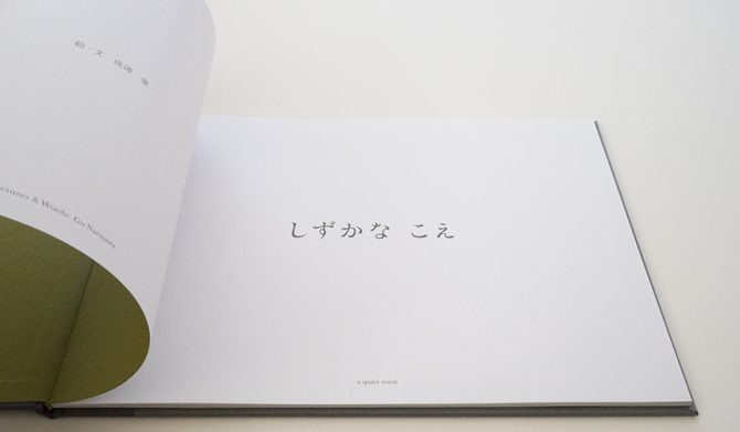
Using a series of paper lithographs created under the theme of "quiet voices" as original works, a short, simple story unfolds, resonating through the white space of the pages.
We asked Mr. Narisawa about the unprecedented starting point for this creation. "Most artworks created through artistic activities are unique pieces. I've always thought about how to connect these created works with more people. However, I have some reservations about 'reproducing' works that have been arrived at through trial and error. That's when the idea of creating 'a book as artwork' in the style of a picture book came to me."
The carefully crafted words and softly colored illustrations in "A BOOK" gently seep into the reader's heart.
"By adopting the style of a picture book as the format for an art piece, I was able to overcome my reservations about 'reproduction,' which was a significant discovery," says Mr. Narisawa. "Furthermore, compared to viewing a painting on a wall from a distance, the act of picking up a book and turning its pages psychologically brings the viewer and the artwork closer. Indeed, the feeling of it naturally entering one's heart might be precisely because of the picture book style."
The "Techniques" and "Commitment" for Enduring Enjoyment
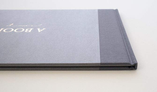
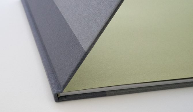
The binding incorporates the skill of artisans. With the desire for the book to be owned and read for a long time, the entire surface is finished with hardcover binding using cloth-like paper, achieving both a comfortable touch and durability. Additionally, the spine is reinforced using a traditional method called a "se-tsugi hyoshi," where cloth is applied to the spine, further enhancing its strength. To evoke a sense of the extraordinary, pages made of extremely thin paper are incorporated at the beginning of the book.
The presence and expertise of bookbinding artisans are indispensable for bringing these elements together and continuing production.
The content features paper lithographs, whose charm lies in their gentle color palette and the unique texture resembling "scratches" created by the paper's surface. This texture is composed of the paper's inherent color and subtle shades of similar hues. The impression of these original works can easily change depending on the viewing environment, such as lighting. Through numerous discussions with the printing director, the artwork was reproduced at its original size, resulting in a print with a subtle yet impactful presence despite its delicate colors.
Furthermore, the text that conveys the story, both in Japanese and English, uses original typefaces created to match the worldview of the work. These characters connect the reader to the story without ever being intrusive. Simple, elegant characters are arranged on the pages.
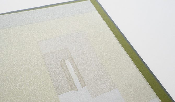
Words and images that gently accompany the reader's heart. "Finding seeds that bring about a happy feeling" is one of the inspirations for creation, according to Mr. Narisawa.
"Every day is a mix of sad things, happy things, and things that don't evoke any particular feeling. Amidst this, I reflect on what specific experiences bring me a sense of happiness and why I perceive them as good. That time, in turn, refines into creative inspiration and concrete imagery. Eventually, these become 'seeds' (reasons) that bring about happiness, and by creating works like a field sown with such seeds, my wish is for the viewer to find discoveries, joy, and happiness that I could never have imagined."
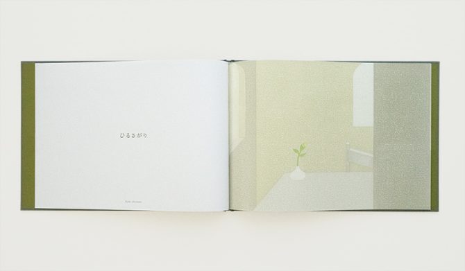
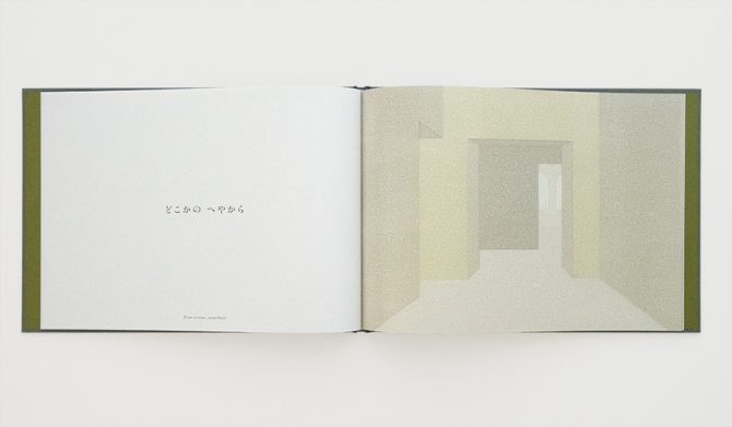
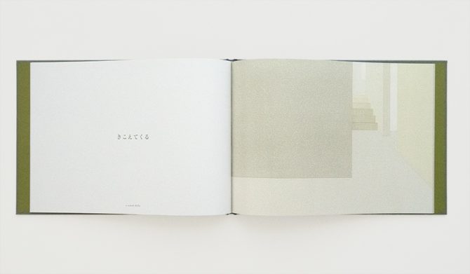
Mr. Narisawa is planning a second and third "A BOOK." The expressive techniques of the art, the story, and the corresponding format and binding style may need to change depending on the theme.
However, the core ideas of "finding seeds that bring about a happy feeling" and bringing the audience and artwork closer will remain unchanged. Mr. Narisawa stated that he wants to create more "books as artwork" by leveraging "A BOOK" as a platform for expression.
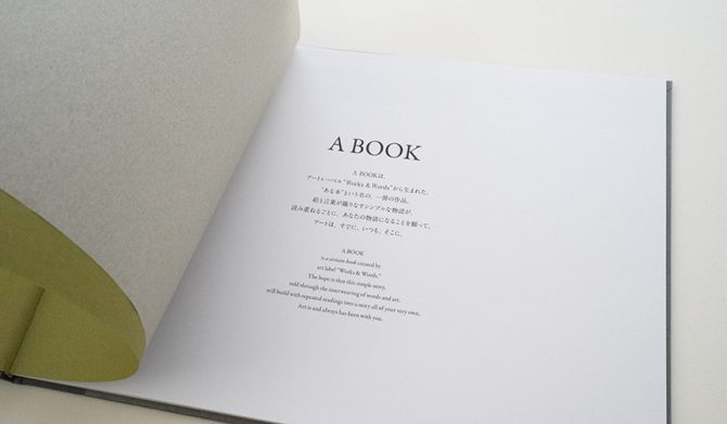
A BOOK ~Quiet Voices~
Illustrations & Text: Go Narisawa
Size: A4 Landscape (H217mm x W302mm x D10mm)
Weight: Approx. 430g
Specifications: Spine with cloth binding, title foil-stamped on cover, endpapers, separate insert, offset color printing, 32 pages total, Japanese/English bilingual notation
Price: ¥3,500
Available at: Works & Words Official Online Shop (https://www.narisawago.com/shop/)