junhashimoto | Spring/Summer 2014 Collection
junhashimoto
Infusing stoic, rugged items with a playful spirit
The latest collection, featuring a subtle "inside" twist
Regarding this season's lookbook shoot, designer Jun Hashimoto notes, "The world we've created, using 'gunjo'—a uniquely Japanese shade of blue—as the backdrop, subtly expresses a Japanese aesthetic." Here, he discusses the latest collection themed around "inside."
Text by KAJII Makoto (OPENERS)
Playfulness woven throughout
—What is the theme/concept for the Spring/Summer 2014 collection?
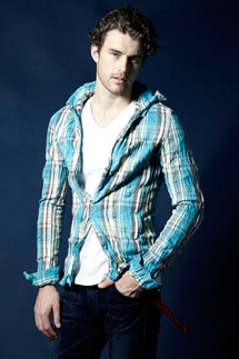
The theme is "inside." Our concept was to incorporate playful elements in various details, even in unseen areas, and we've scattered these playful touches, like those in the linings, throughout the collection. In older Japanese, this might be expressed as "kabuku," meaning to dress eccentrically. By embedding this "inside twist" in the linings and details, we've infused the items with a sense of playfulness. The creation is stoic and rugged. In addition to junhashimoto's signature simple design, the stance of treating the wearer with hospitality is its greatest appeal.
—What were the key points and elements you wanted to highlight in this season's lookbook shoot?
We've expressed a subtle Japanese aesthetic in a world created using "gunjo"—a uniquely Japanese shade of blue—as the backdrop. We minimized the lighting to make the pieces appear to emerge from this distinctive blue hue. I'd like you to check out the playful linings and the way the details stand out, which are scattered throughout.
—What are the differences in styling, silhouette, and color compared to last year's Spring/Summer collection?
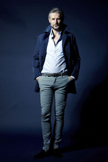
Compared to previous years, the silhouettes for tops have a bit more room this season. Conversely, the bottoms are designed to look as slim as possible, creating a unique asymmetrical silhouette. We've also proposed resort styles with a bit of ease, moving away from a strict adherence to tight fitting. Using navy as a base and various shades of blue, we've created a look reminiscent of the colors found in ukiyo-e prints.
—What is the key look (coordination) for this season?
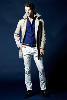
It's the coordination featuring the coat (bottom right). This is the main look, centered on blue, which highlights our iconic color. The nylon coat, designed with functionality in mind, boasts vibrant color and is notably lightweight. Coordinating in the same color tone is a consistent theme each season. The gentle gradation that naturally emerges is its charm.

Expressing an urban oasis with linen
—What are the key items and key colors?
The key items are leather pieces. In particular, I highly recommend the suede with a mesh lining, perfect for spring and summer collections. The lining, which reduces stuffiness during perspiration, is stretchy, and we created a material with an original military pattern transfer. It conforms to body movements and is a superb item where you can fully experience the playfulness that aligns with both functional beauty and the main theme.
—What "materials" were you particular about this season?
We used linen, a natural cooling material, to express an urban oasis in response to recent heatwaves. We also used quick-drying materials and paid close attention to fabric selection, considering various uses to minimize discomfort when wearing tight clothing.
—What are you currently noticing in the fashion scene?
How long will the 1980s fashion revival continue?
—Please share your personal goals for 2014, whether for work or private life.
To support junhashimoto's global expansion, I aim to improve my personal English skills.
Major Retailers
Estnation, Hankyu Hanshin Department Store, Mitsukoshi Isetan
Inquiries
junhashimoto Omotesando Hills
Tel. 03-5414-1400
http://junhashimoto.com/