tim. | Spring/Summer 2014 Collection
tim.|TIM
Playful Classics for the Modern Gentleman
Embrace a Richly Varied, Mixed Aesthetic
“Before each season begins, I always return to the fundamentals,” says Daiki Matsumura, designer of “tim.” “I start by considering what I specifically want to convey, the current mood, what kind of allure I want to express, whether it should blend in or stand out… For this season, I created six types of silk tie fabrics and incorporated them into various details, such as the linings of jackets and trousers, to express a sense of esprit. I also intended to use mesh materials extensively from the outset.”
Text by KAJII Makoto (OPENERS)
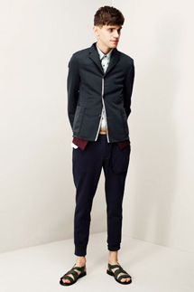
Relaxed Setups
──What is the theme/concept for the Spring/Summer 2014 collection?
While I don't set a theme every season, for this collection, I've incorporated tie fabrics like crest, glen check, and stripes, woven from silk, into jackets and trousers to add a touch of esprit. I also extensively used mesh materials, including linen-silk mesh, sponge-like mesh, and fabrics woven on a 'karami-ori' loom that resemble knits, as well as hemp velvet and specially coated silks.
The setups are also meant to be worn in a relaxed manner, without being tightly tied. The style keyword is 'sportswear with urban elements.'
──What were your priorities and what should people pay attention to in this season's lookbook shoot?
It’s the same as always. Especially for Spring/Summer, I try to avoid making jackets and other items look too heavy. I aim for a balance that feels light, creating a subtle sense of unease. But without being overly conscious of it.
──What are the differences in styling, silhouette, and color compared to last year's Spring/Summer collection?
I haven't done anything particularly new.
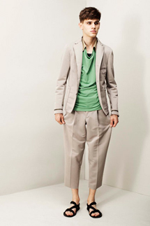
──What is the key look (coordination) for this season?
I believe the green and beige setups capture the distinctive nuance of tim.

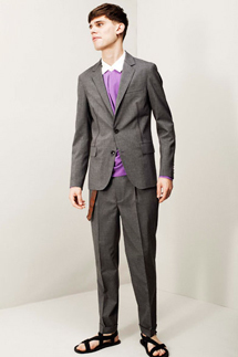
Accent Colors: Green and Purple
──What are the key items and key colors?
For colors, I always use gray, navy, and brown as base colors, and this season I've added green and purple as accent colors to complement them. This adds softness, not just rigidity. While not a specific key color, I recommend the brown setup. It offers a variety of enjoyable mixed textures, with twists in the material, construction, and balance.
──What "materials" were you particular about this season?
The "C/Silk paper cloth" uses silk filament yarn for the weft, creating a subdued luster. It has a different texture and appearance from nylon or polyester. The warp is densely woven, giving it a crisp feel. When you wear it, you'll notice how light it is. The silk's luster changes slightly in direct light, and its impression differs between indoor viewing and natural light. This material was developed over a considerable amount of time, and you should be able to feel the difference when you wear it and touch it.
──Please share your personal goals for 2014, whether for work or private life.
To live a more comfortable daily life while taking in appropriate stimulation. And to output that input with a slight twist.
<Main Retailers>
URBAN RESEARCH, pubic, 1LDK
Inquiries
alpha PR
Jingumae 5-36-6 Cary Mansion 1A/2C, Shibuya-ku, Tokyo
Tel. 03-6418-9402