FASHION /
MEN
April 6, 2015
tim. Fall/Winter 2013-14 Collection
tim.
A touch of subtle playfulness, a sense of ease.
Beyond "Relaxation"
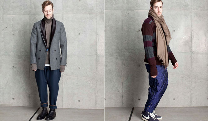
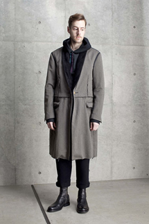
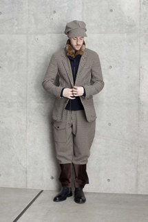
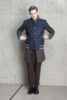
For this season's lookbook shoot, Daiki Matsumura, designer of "tim.", explains, "We focused on how to incorporate colors like green and blue into winter. Especially with tailored sets, we aimed for a sharp nuance rather than constant relaxation." Pay attention to the sharp-edged tailored sets and styling featuring key color items.
Text by KAJII Makoto (OPENERS)
A strong focus on "sight, touch, and taste"
──What is the theme/concept for the 2013-14 Autumn/Winter collection?
It's a theme that runs throughout the year: we focus on textiles and quality, proposing designs that leverage the unique characteristics of the materials, and styles that feel noble yet possess a relaxed warmth and gentleness.
What defines the brand is the meticulous craftsmanship of every thread and weave, creating materials that are then enhanced by designs. Because clothes are quickly replaced within a short six-month season, we aim to create garments that people will find themselves reaching for in the next season as well. We infuse our own nuances and a sense of the times into what we strongly focus on: "sight, touch, and taste" (where "sight" refers to design and color, "touch" to the feel and texture, and "taste" to the comfort and fit when worn).
While we don't set a distinct theme for each season, this season I explored what lies beyond the "relaxed feel" that has been a consistent thread for the past few seasons. While retaining that relaxed sensation, I've added a touch of sharpness.
Although we have structured items like suits, we always maintain a street sensibility. We believe it's important not to present everything too earnestly, but to incorporate a subtle element of playfulness and ease somewhere.
──What are the key looks (coordinations) this season?
Looks featuring sharp-edged tailored sets, and looks incorporating key color items.
Focus on Royal Blue and Elegant Green, overdyed on grey
──What are the key items and key colors?
The key item is the jacket. Jackets are always central to our menswear collections. This season, in addition to tailored jackets with full canvas construction, we've expanded the range to include single-layer piped jackets, and a 4-button unbalanced jacket that expresses distortion through its pattern and construction.
The key colors are royal blue and elegant green. By overdying grey, we've achieved a melange effect that makes them easy to incorporate as a sophisticated accent, lending them depth and a subtle richness.
──What materials did you focus on this season?
We used our standard 85% wool, 15% cashmere melton. By overdying the top-dyed grey material, we created deep royal blue and elegant green hues. They are perfect for adults to express color in winter!
Additionally, the 120-count double-ply wool gun club check is incredibly soft and has a relaxed feel, yet it's a classic pattern.
And then there's the wool pile. This is an evolution of our standard material (in its second season). We made the surface yarn three times finer than last year, while ensuring the core connecting yarn has a more substantial, chewy texture. It's completely stress-free.
<Main Retailers>
Barneys Japan, Ron Herman USA, Beams, Edition, 1LDK
Inquiries
alpha PR
Tel. +81-3-6418-9402
http://alpha-tokyo.com