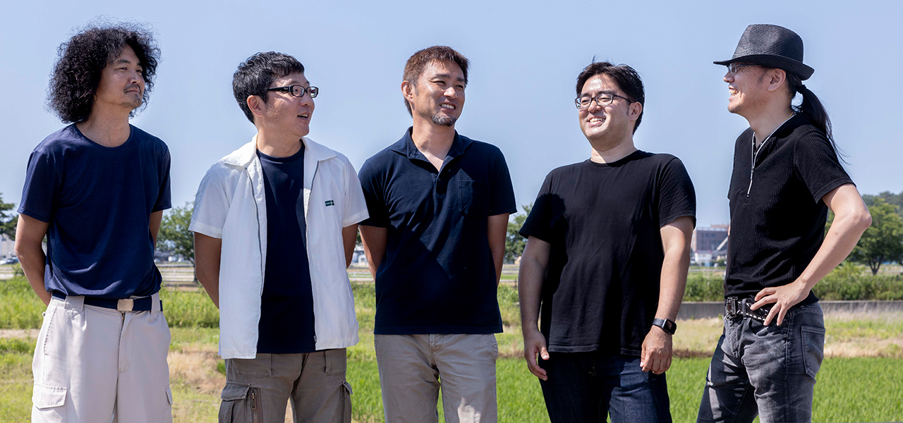
From left to right: Mr. Tatsu Kida of Kida Seitojo, Mr. Shigeharu Higashi of Higashi Seitojo, Mr. Ke
The Making of fragmentdesign's First Kutani Ware Painted BE@RBRICK Model (Part 2) | MEDICOM TOY
MEDICOM TOY
Continuing our report from Komatsu City, Ishikawa Prefecture, on the creation of the Kutani BE@RBRICK fragmentdesign.
We've collaborated with Midland Creation since the release of the "Saint Seiya" decorative plate in 2016, and they have been responsible for printing the logos on the inner legs of previous Kutani BE@RBRICKs. Shohito Naka had been considering applying overglaze enameling to the Kutani BE@RBRICK using Seikou's transfer decal technology for future projects. This fragmentdesign BE@RBRICK is the first of these endeavors. In this second part, we spoke with Keita Kitano, President of Seikou, and his younger brother, Tomomi Kitano, Managing Director, about the process from development to completion.
Photograph by OHTAKI Kaku | Text by SHINNO Kunihiko | Edit by TSUCHIDA Takashi
A New Approach to Printing Technology Beautifully Recreates Tradition, Enabling Mass Production
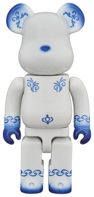
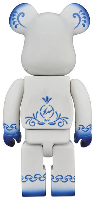
Kutani ware is traditionally characterized by outlining with "gosu" (cobalt blue) and then applying thick layers of five colors—red, yellow, green, purple, and indigo blue—known as "gosai." However, Seikou's transfer decals, using their original Kutani ware paints, can reproduce these characteristics through printing. The high transparency of the melted glass after firing, the thick application of the paint, and the vibrant colors of the paint transformed into glass are all remarkable, enabling mass production of products with uniform precision that was difficult to achieve with hand-painting.
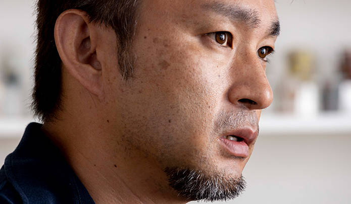
"When I saw the design from fragmentdesign, my first step was to consult with Keita and Tomomi. To mass-produce this with high quality, we had no choice but to use Seikou's transfer decals. But I wondered, how much could they really express?" says Shohito Naka.
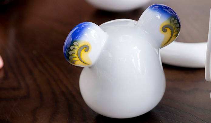
"Since it was a single indigo color inspired by "sometsuke" (underglaze blue), I initially suggested that it would be better to hand-paint it to capture the atmosphere. However, Mr. Naka was adamant about achieving a uniform, industrial finish, so we decided to proceed with printing. I did mention that the gradient part would be impossible to reproduce with printing and asked him to give up on that," explains Keita Kitano.
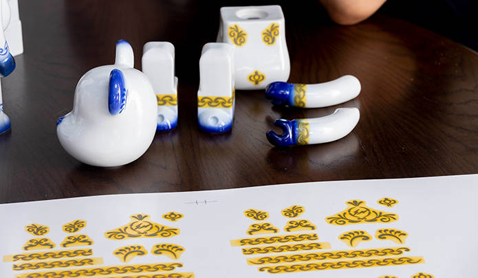
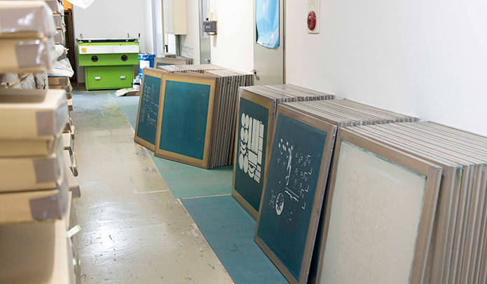
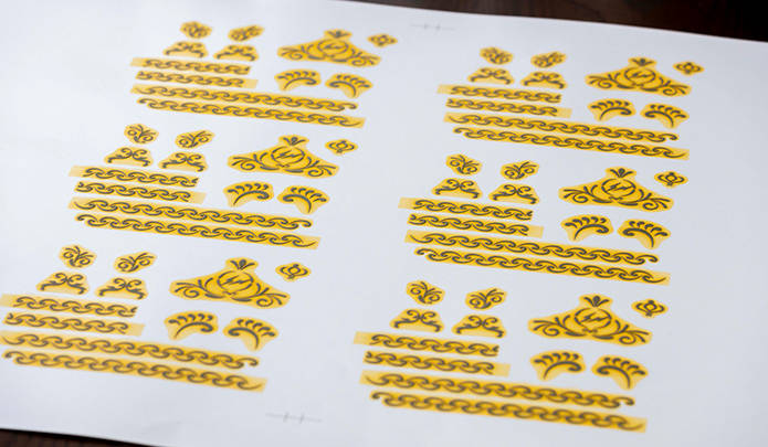
Seikou was responsible for the arabesque patterns on the ears and body, the chain patterns on the wrists and ankles, and the thunder logo symbolizing fragmentdesign on the back. Touching these areas, one can clearly feel the thickness and raised texture of the transfer-applied decals.
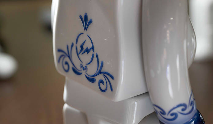
Often, the underlying outline can be absorbed by the paint during firing and disappear, but Seikou's transfer decals allow for the sharpness of the design to be retained while still capturing the essence of Kutani ware.
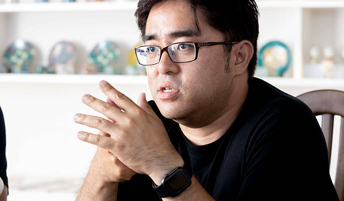
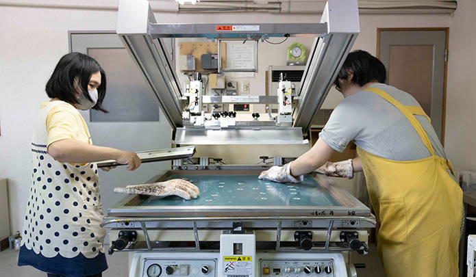
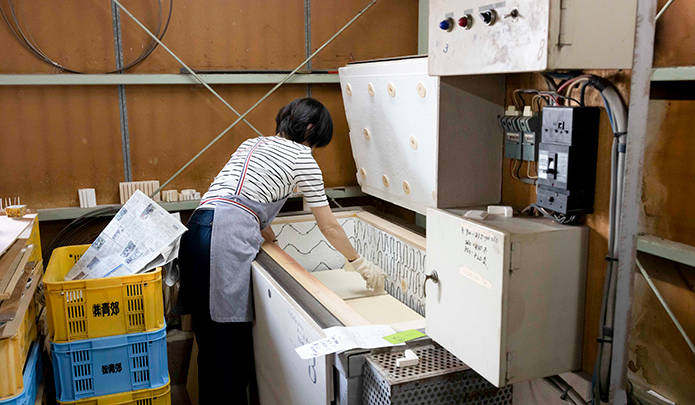
"Because the paint itself has thickness, the application process requires special techniques. Even a tiny air bubble can cause the paint to lift during firing, making corrections impossible. We have about 40 skilled artisans dedicated to the application process at our company, and for this BE@RBRICK, we assigned the most experienced among them," says Keita Kitano.
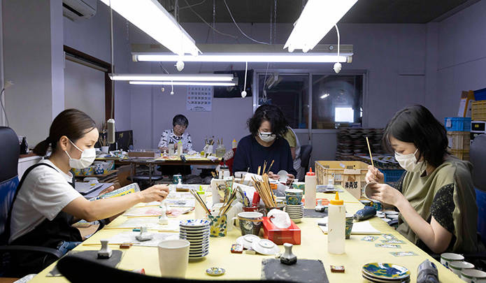
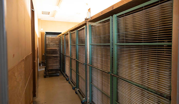
"When fired in the kiln, some areas develop roughness, or unforeseen losses occur. Since the BE@RBRICK is incomplete if even one part is missing, we can't let our guard down until it's fired. For this BE@RBRICK, we used electric kilns, firing four units at a time overnight, switching between them. The yellow part of this transfer decal burns away, allowing the outline and paint to adhere," explains Keita Kitano.
"Kutani ware paints have a tendency to spread, so even if we take CAD data and print it onto transfer paper as is, it won't align correctly when applied by hand. Therefore, we intentionally make them slightly shorter, calculating for the hand movements of the person applying them," says Tomomi Kitano.
"Our studio used to hand-paint everything for the market until the previous generation. That accumulated expertise allows us to develop our printing processes while anticipating how a hand-painted finish would look. That's our strength. The colors are deep, and we consciously consider the design composition from the outset to ensure seamless joins. That's our strength," says Keita Kitano.
"Mr. Naka himself is an artist, so he has strong convictions. He requests things that are unthinkable by conventional standards, but when we try them, they surprisingly work out. Thanks to Mr. Naka, we've expanded our possibilities in many ways," says Keita Kitano.
The Kutani BE@RBRICK was born from the unwavering passion and masterful direction of producer Shohito Naka. With the completion of this first painted model, a collaboration with fragmentdesign, we eagerly anticipate future developments.
"Whether we can mass-produce painted items depends on Seikou's technology, and I believe it also depends on the proposals we make to kiln operators and publishers. Many people might have learned about Kutani ware for the first time through fragmentdesign's involvement. We want to further increase recognition for Kutani BE@RBRICK through enjoyable projects," says Shohito Naka.
Produced by: Shohito Naka (Midland Creation)
Size: Approximately 280mm in height
Release Date: Scheduled for release in September 2019
Price: ¥185,000 (excluding tax)
Retailers: Limited quantity release at MEDICOM TOY PLUS
BE@RBRICK TM & © 2001-2019 MEDICOM TOY CORPORATION. All rights reserved.
MEDICOM TOY PLUS
Tel. 03-3479-5555