Car
April 15, 2015
AUDI | Ryutaro Matsui vs. Audi R8 (2): The Engine as a Test of Taste
Vol.1 Tatsuya Matsui vs. Audi R8
Chapter 2: The Designer's Sense, Tested by the Engine
The engine is the greatest spectacle of a supercar. Focusing on the gravitational pull of design that resides in the details,Audiwe zoom in on the details of the R8.
—Let's shift our focus to the details. What points catch your eye?
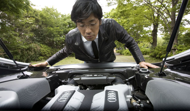
MatsuiAutomakers project their future identity into their flagship models. The most potent expression of this is the engine, a culmination of engineering prowess.
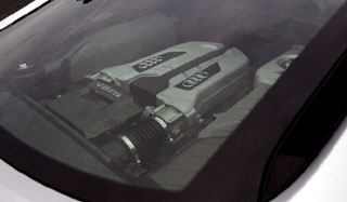
This R8 also features a design where the engine is visible through a glass hood. I felt this expressed its pride as a supercar.
—When you look at an engine from a professional perspective, what aspects capture your interest?
MatsuiIt's about how the designer has reconciled the engineer's assertions.
Especially when the engine is displayed like this, it's about how refined a product has been achieved. This also offers the pleasure of deciphering the designer's thought process.
—That's a rather unique perspective.
MatsuiI feel the influence of the Bauhaus movement in the R8 as well. Its simple, orderly design that doesn't overstate itself is a tenet of modern design, making it very easy to understand.
Modern engines are no longer mechanisms that amateurs can tinker with, but the arrangement, where you can intuitively grasp where everything is located, ultimately conveys a sense of 'beauty'.
As an Audi fan, and without regard for my own standing, I wonder if perhaps just one Audi emblem on top of the engine would have sufficed. It sparks contemplation.
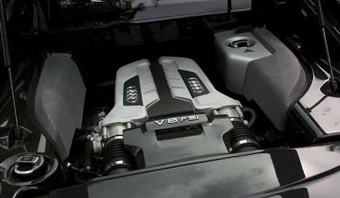
—Since it's a V8, perhaps it was meant to indicate the number of cylinders?
MatsuiEven so, I'm curious about the meaning behind not choosing just one logo at the front. Trying to understand the designer's psychology allows for a deeper love of the car, which is enjoyable.
And the color division. To honestly express the engineering, parts made of different materials would be painted differently, but this engine uses a two-color scheme even with the same material. Are such attempts an expression of a desire to transcend functionalism?
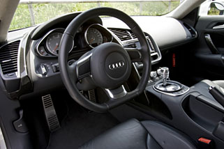
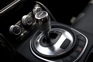
—In terms of orderliness, the interior is also simple, isn't it?
MatsuiIt extensively uses artificial, geometric lines. As a user, I find the design of the instrument cluster interface visible through the steering wheel to be important. Overall, the circular lines seem to be an expression of Audi's logo, where calculated features promise safe driving.
Also, the seating position is not as low as I expected, and the cabin doesn't feel cramped. I believe these aspects are the result of research aimed at everyday usability. Even with a wild impression, the lineage cannot be hidden; it is filled with Audi's characteristic earnestness.