Michiko Fujiwara's "Color" Stories, Part 6: November – The "Grayish" Hue We Need Now?
November 2008: "What We Need Now is a Touch of Gray!"
This is a series where Michiko Fujiwara, a celebrated hair and makeup artist, shares episodes related to "color."
Of our six senses, how much drama does our sense of sight weave into our daily lives? When we perceive and savor the colors that meet our eyes, drama is born.
This month's theme is "grayish." My thoughts drift from spring and summer collections to politics...
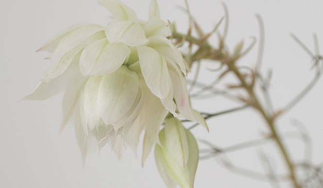
Text byMichiko FujiwaraPhoto by Jamandfix
Fashion is a strong reflection of the "mood" of the times.
For the Spring/Summer '09 collections, there are colors that captivate me. They are grayish pale tones, like pink, purple, yellow, or peppermint, or perhaps a mix of these with a transparent, bright gray.
Why am I drawn to such gentle, soft hues? If I had to venture a reason, perhaps it's a subconscious desire for these soft colors to envelop the uncertainty of our political and economic future. Or is it simply that my own preference, which has favored vivid colors until now, has changed? Whatever the case, fashion is a strong reflection of the "mood" of the times, so this change must not be mine alone.
Speaking of which, though it may be common knowledge that Japan was once heavily criticized by other countries for being a nation that couldn't clearly say "yes" or "no" (and this criticism persists to some extent), I recall feeling indignant, thinking, "That's fine! It's precisely because we understand the merits of both yes and no that we sometimes can't give a clear answer! Don't they understand the value of the in-between?"
Of course, ambiguity increases the probability of problems arising, and even in Japan, a nation with such a tendency, we have phrases like "Make up your mind!" The color gray, an intermediate between black and white, is often used in a negative sense, as in "gray area." While it can be interpreted positively as understanding both sides, in a negative light, it signifies indecisiveness, an inability to choose. Perhaps gray most vividly represents the dual nature of things, where good and bad are two sides of the same coin.
I pondered the difference between the image of gray and these grayish hues, and I believe it lies in the presence or absence of transparency. Transparency transforms a base color into a nuanced, beautiful shade. Without it, however, it merely obscures. In that sense, I feel that what is needed now, in politics and in people, is this very transparency.
We need transparency that can draw out the best of both sides, making 1+1 greater than 2. It's not the time for "me, me, me," loudly asserting oneself and reducing 1+1 to merely 1 through "opacity." Watching the political news on television recently, I'm increasingly convinced of this. ...Ah, perhaps that's why I was drawn to the grayish tones in fashion!?