
LOUNGE /
FEATURES
September 5, 2025
【Takashi Tokuo's Biased Collection Vol. 1】Why I Collect IBM's "THINK".
LOUNGE | The Biased Collection of Takashi Tokuo, GREAT CONNOISSEURS
A CONNOISSEUR is someone with discerning taste, an expert. This feature introduces Takashi Tokuo, a "Great Connoisseur" with an impressive collection spanning music, subculture, interiors, vehicles, fashion, and more. Each installment delves into one item from his vast collection.
Text by TOMIYAMA Eizaburo | Photographs by TAKAYANAGI Ken
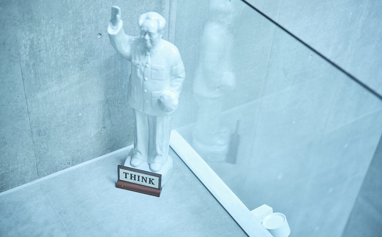
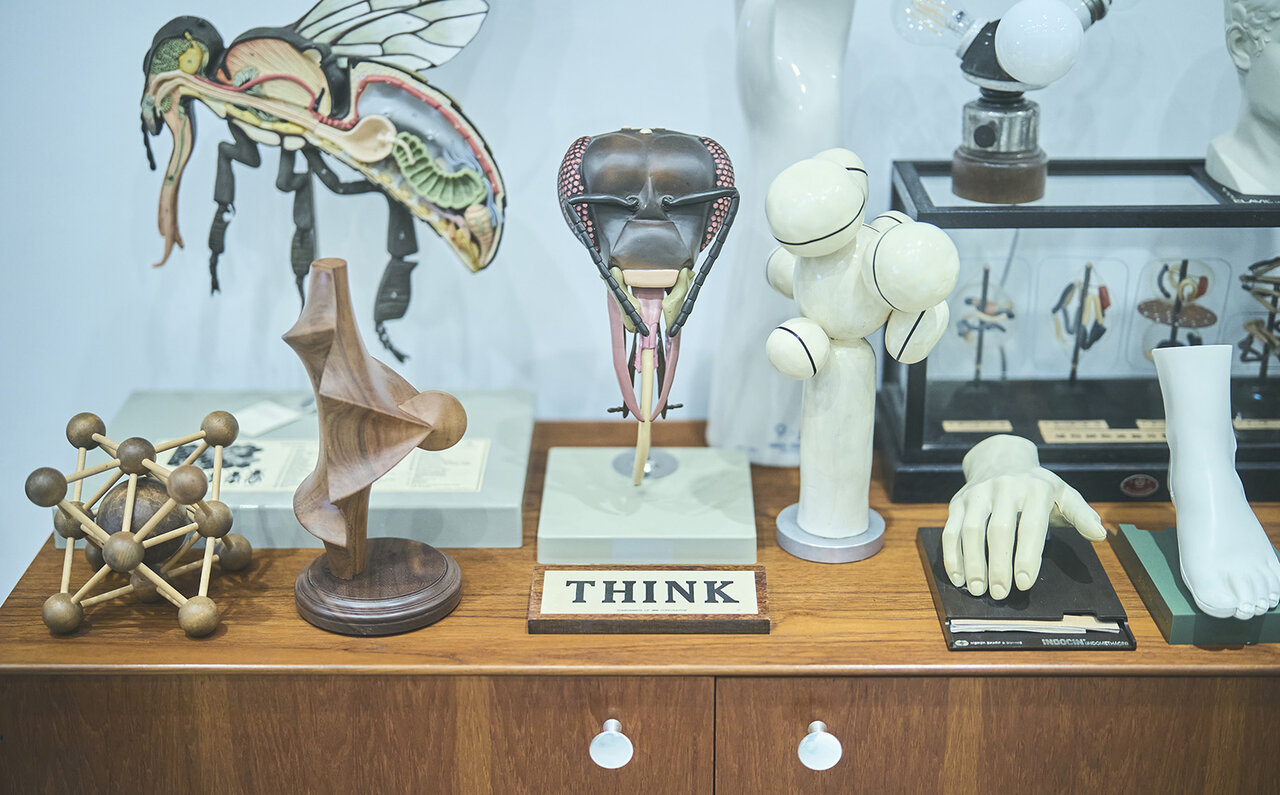
Tokuo’s home is adorned with IBM’s corporate slogan, “THINK” signboards, displayed everywhere: near his desk, beside biological and chemical objects, in front of a Mao Zedong statue, atop an open-reel tape recorder...
“Everyone who visits my home comments on the ‘THINK’ signs, saying they’re nice. But I rarely hear that they went on to buy one themselves (laughs). Maybe they get their fill just by seeing them here. (laughs)”
Tokuo has built a collection guided by his own aesthetic, independent of public opinion. His IBM “THINK” items are a perfect reflection of this personal inclination, existing outside established markets or valuations.
Paul Rand's Designs Sparked His Interest in IBM
“The starting point for my collection was Paul Rand (1914-1996), the designer who created the IBM logo.”
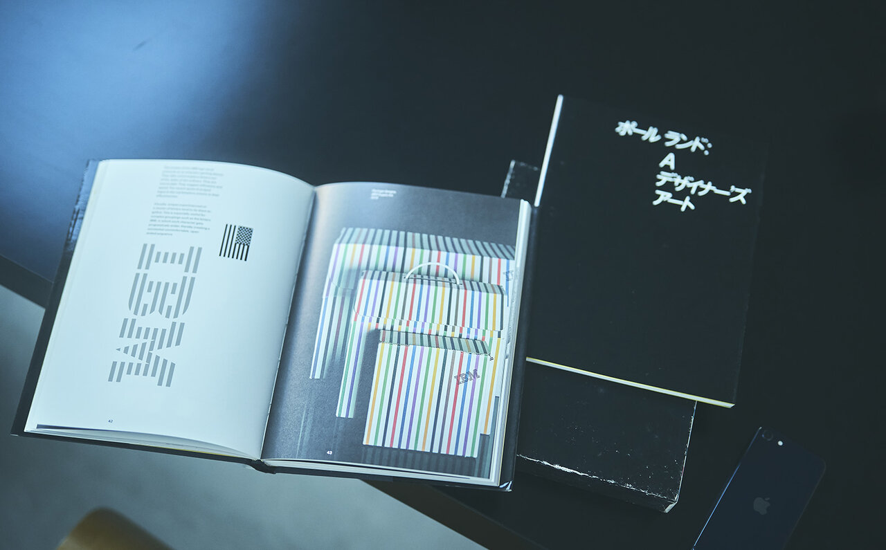
Paul Rand, one of America’s foremost graphic designers, created numerous iconic logos, including those for UPS, ABC, and Westinghouse.
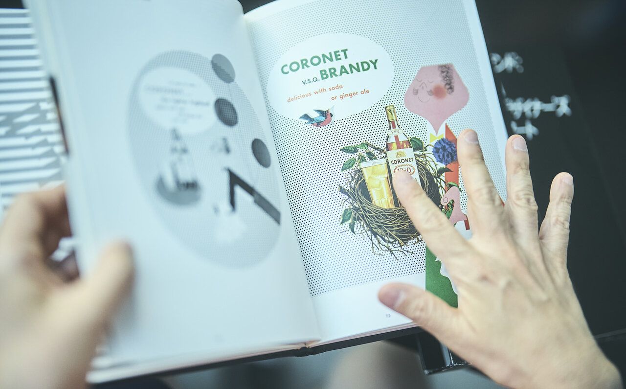
“I used to collect items related to Coronet VSQ Brandy, with its cute character illustrations. Paul Rand wasn’t his real name; he adopted it to conceal his Jewish heritage. But from a design perspective, ‘Paul Rand’ is memorable, with its well-balanced four-letter alphabets. I’m deeply drawn to an aesthetic that can even direct one’s own name.”
Tokuo began his serious collecting in his teens with corporate advertising materials. This is why over half of his extensive collection relates to various companies, not just IBM.
“When I first became interested in corporate advertising and logos, I collected old books on ‘modern publicity,’ especially from the 1950s. Kanda’s secondhand bookstores had many wonderful foreign books on the subject. Among the works of excellent designers, Paul Rand’s logos, logotypes, and illustrations particularly appealed to my taste.”
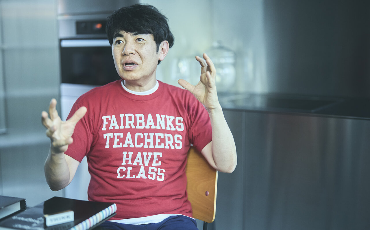
Takashi Tokuo
Owner of Daikanyama UNIT. Event producer. Previously handled art direction for major international brands. Has also designed CD jackets, corporate logos, and graphics for events. Instagram:@tokuo_tower@ctoc_tokyo
Owner of Daikanyama UNIT. Event producer. Previously handled art direction for major international brands. Has also designed CD jackets, corporate logos, and graphics for events. Instagram:@tokuo_tower@ctoc_tokyo
From IBM's "THINK" to Apple's "Think Different": A Narrative Arc
“THINK” was the slogan championed by Thomas J. Watson, the first president of IBM.
It encouraged all IBM employees to “think for themselves while working,” and the slogan was displayed everywhere within the company—on desks, walls, pens, and even clocks.
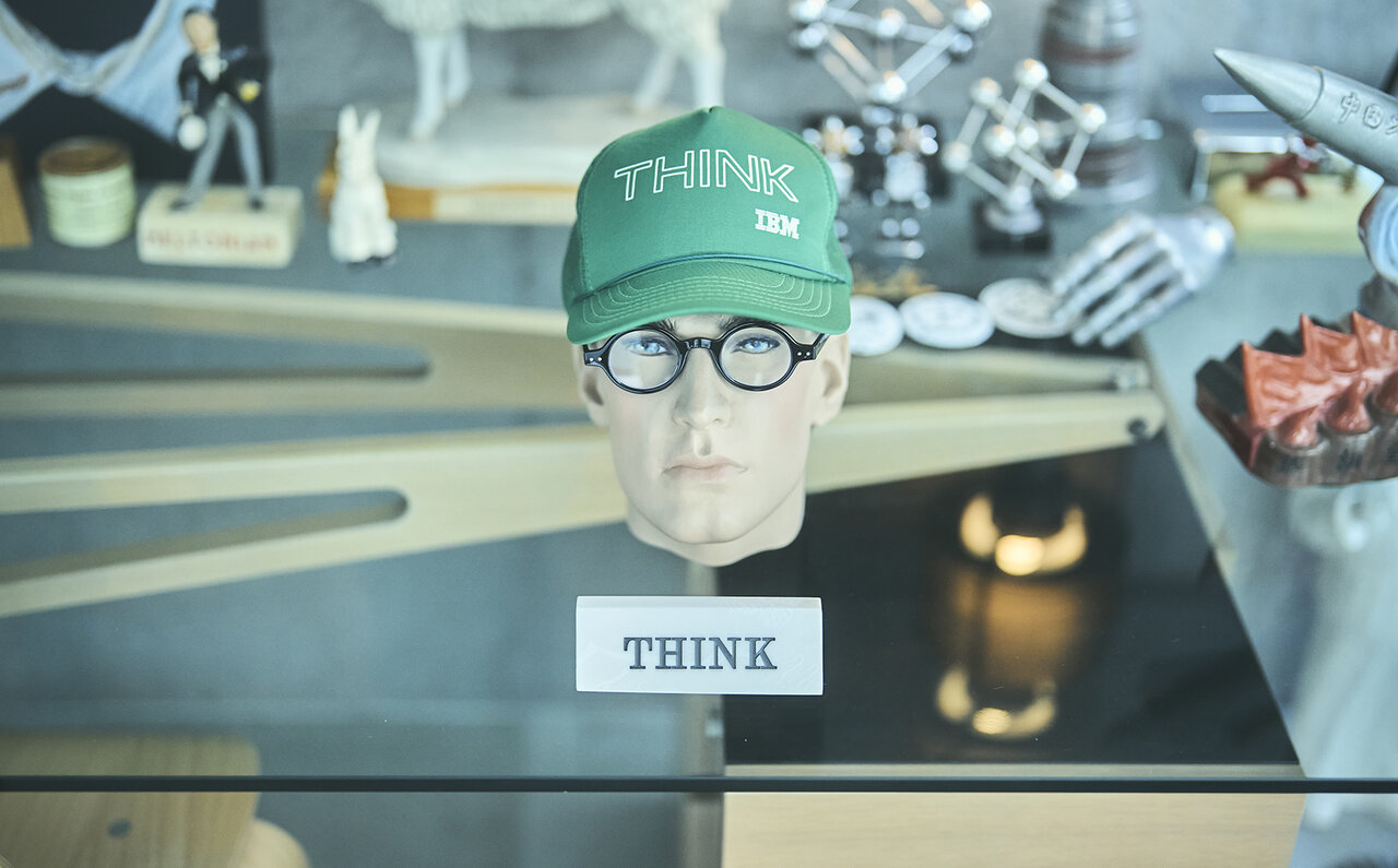
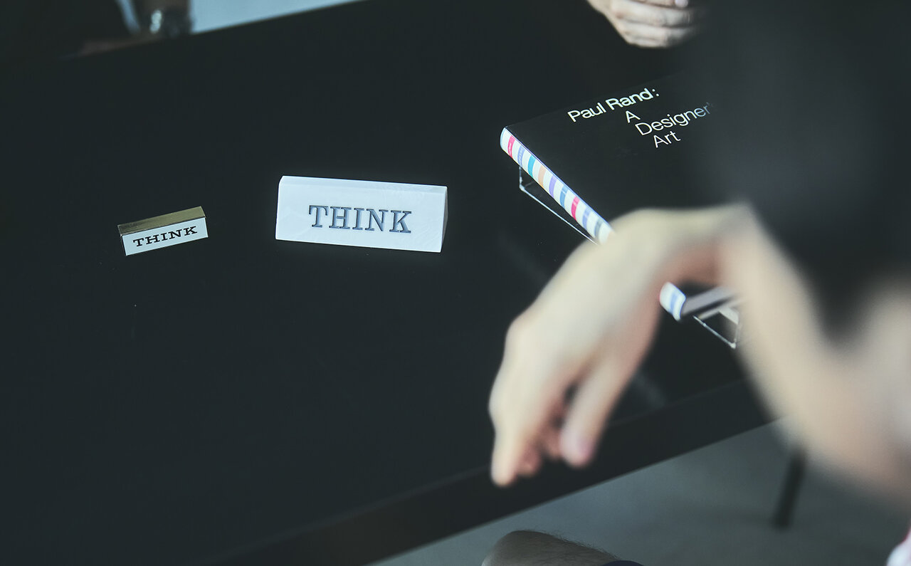
“THINK” on a cap, too. Tokuo enjoys placing these items playfully, integrating them seamlessly into his collection.
“THINK” on a cap, too. Tokuo enjoys placing these items playfully, integrating them seamlessly into his collection.
The “THINK” inscription on the cover of notebooks distributed to employees at the time eventually led to the product name “ThinkPad.”
The items Tokuo collects were all originally produced for internal use within the company. Some signboards even bear the names of employees.
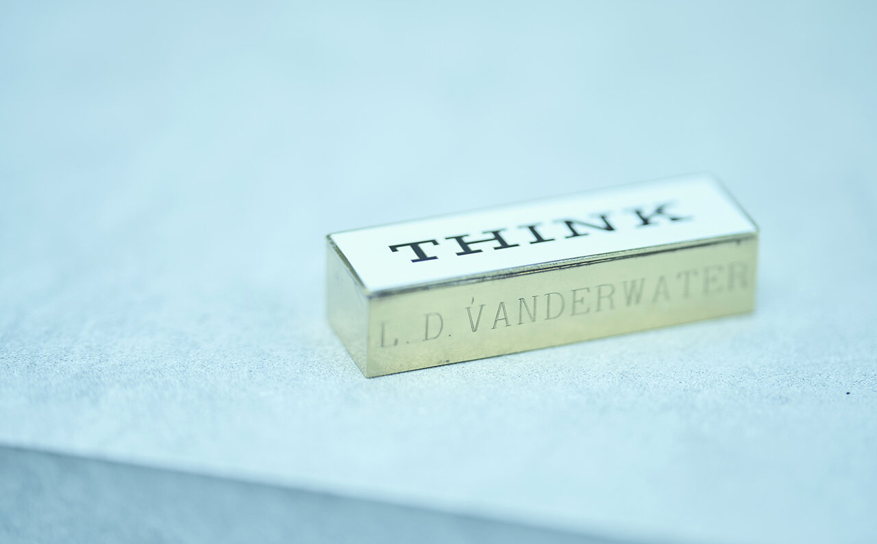
Perhaps belonging to a senior employee at the time, the name L.D. VANDER WATER is engraved on the bottom.
“‘THINK’—just ‘think’—is still a great slogan, isn’t it? It’s direct and sleek. Although it’s an American company, it has a German-like solidity. (laughs) That’s what I like about it, and why I’ve been collecting them.”
IBM, with its global branches, produced “THINK” products in local languages, maintaining the same specifications as those in the home country. In Japan at the time, items bearing the phrase “考えよ” (Kangaeyo - Think) were displayed.
“IBM was once the king of the computer industry. Then, in the late 1970s, Apple Computer emerged, challenging the reigning monarch. It feels like destiny that after being ousted from his own company, Steve Jobs returned and launched the slogan ‘Think different’ in 1997.
While an American advertising agency conceived it, Jobs was undoubtedly in charge. From then on, Apple’s performance saw a V-shaped recovery. It’s fascinating how this is strongly linked to Jobs’ genius being revealed to the world and the slogan “THINK.” The “Think different” campaign was incredible, wasn’t it? Featuring historical figures who changed the world like Einstein, Maria Callas, and Martin Luther King Jr. What was once the era of ThinkPad PCs started to feel dated, and the innovative PowerBook from Apple became the preferred choice. I love those kinds of ties (connections).”
People who learned from “THINK” went on to create “Think different” and forge ahead. Incidentally, Paul Rand also designed the logo for NeXT, the company Jobs founded after leaving Apple.”
Jobs’ talent wasn’t limited to management and products; his dedication to casting and design was also extraordinary.
A Slogan is Ideology and Design
“IBM’s brilliance lies in its establishment of guidelines when Paul Rand created the logo in 1956, ensuring consistent visual corporate communication. They aligned ideology with design. While this is standard practice for most companies today, it was truly remarkable to enforce it so rigorously back then.”
The “THINK” collection features various fonts. While IBM had strict guidelines for its logo, the internal slogan “THINK” appears to have been produced more casually.
“They were strictly for internal use, after all. Given the era and perhaps orders placed by different departments, I imagine there was a certain looseness in their production, which I find amusingly American.”
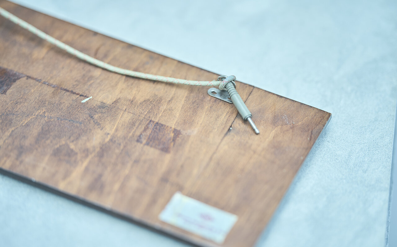
The original hanging cord is still attached. It's interesting to see it replaced with a makeshift cable.
Tokuo’s first “THINK” signboard purchase was from an antique shop in America.
“I was told it was something senior employees would place on their desks. Since then, I’ve bought them whenever I find them; I probably have about 20 to 30. I don’t just collect ‘THINK’ items; I only buy those in good condition. My decision is based on whether the design integrity is intact, rather than the price. I don’t typically buy items for their perceived ‘vintage charm’.”
Beyond the "THINK" Collection: A "Delicious Life"
In Japan, the importance of corporate identity began to be emphasized in the early 1980s, but few companies seemed to achieve success.
“Even among large corporations, there likely weren’t many executives with the necessary sensibility to make final decisions. The Seibu Saison Group, I believe, was instrumental in changing that. It was that cultural momentum that ultimately shaped contemporary Japanese culture, particularly the culture with a strong Tokyo flavor.
Shigesato Itoi’s copy, “Oishii Seikatsu” (A Delicious Life), perfectly captured the zeitgeist of that era. I feel that the Seibu Department Store’s slogan, “A Delicious Life,” unified the sentiments across music, fashion, literature, and subculture. Without the Tokyo culture of that period, someone like me might not exist.
Generations who experienced that era understand the significance of slogans and copy. Today, with numerous media outlets and the rise of personal broadcasting, it’s rare to find copy that resonates equally across all generations.
Advertising, in its essence, should begin with a strong slogan like “THINK,” complemented by a designer’s work. However, I find fewer opportunities these days to encounter advertising with that kind of profound impact.
With the ease of sampling graphics and videos, everything feels somewhat superficial. While I understand the fast-paced consumption of the digital age, the scarcity of deeply moving advertisements and cultural movements, and consequently, the desired objects that align with them, likely fuels the current nostalgia for vintage items.

That said, I’m not an advertising expert or a corporate researcher, just a collector. If I like something, that’s enough for me. For me, “THINK” represents an element I lack, so I buy these items as a reminder. (laughs)”
“Items that go unnoticed, that no one turns to look at, but I collect them because I love them.” The “THINK” collection is a testament to Tokuo’s passion as a connoisseur. If you’re intrigued, why not start your own search?”