FASHION /
MEN
January 13, 2015
BURNER | 2014 Spring/Summer Collection
BURNER
Season theme: Inspired by "Home Sick"
To Embrace a Relaxed Atmosphere
"For this season's lookbook shoot, I focused on creating a contrast between soft materials and harsh lighting, warm wooden floors and inorganic concrete walls," says Yoshio Hatanaka, designer of "BURNER." Pay attention to the joyful color combinations in the styling!
Text by KAJII Makoto (OPENERS)
Playing with Color Without Losing an Adult Image
—What is the theme/concept for the 2014 Spring/Summer collection?
This season's title is "Home Sick." It's inspired by the idea of "Home Sick" – a feeling of longing for home, and indeed, for all scenes of daily life. The collection embodies this sentiment.
Comfortable-to-the-touch materials, patterns designed for ease of movement, and playful colors and prints. The starting point for Spring/Summer 2014 was homewear incorporating these elements. However, the finished collection is by no means just loungewear. It's suitable for a stroll on the beach, a leisurely read at a cafe, a spontaneous drive, an art exhibition, or even a business meeting. The collection offers a wide range of wearability, from casual to semi-formal, all while exuding a relaxed atmosphere akin to homewear.
Please experience the new style that BURNER proposes.
—What were the key points you focused on for this season's lookbook shoot, and what should people pay attention to?
The key is to create outfits that, while not strictly homewear, can be imagined in various situations by adding just one element to relaxed, everyday wear. This allows for styling that can be adapted to different scenarios.
—What are the differences in styling, silhouette, and color compared to last year's Spring/Summer collection?
Last season's styling focused on harmonizing color tones to create distinct looks. This season, being Spring/Summer, I felt more inclined to play with color combinations. I aimed for a playful use of color while maintaining an adult aesthetic.
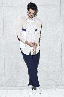
This season, we've significantly reworked the silhouette of our pants. The rise and hip are roomier than before, with a slight fullness in the thigh that tapers sharply towards the knee. We're also offering relaxed silhouettes in items like long shirts.
In terms of color, as always, the collection features striking hues. To convey a sense of cleanliness and transparency, we've used white as a base. We've incorporated jacquard weaves and prints that create a rich texture using only white, presenting an expressive white collection. While last season had a defined color palette, this season we've allowed colors to be chosen freely, adding various hues to white to create different moods and impressions depending on the situation.
—What are the key looks (outfits) for this season?
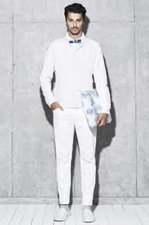
It's difficult to choose just one key look, but I'd have to pick the all-white outfit. It features slim, tapered skinny pants, a stadium jacket with a knit body and synthetic sleeves, and a blue bow tie as a focal point. While simple, an all-white coordination is rare, so we added accessories to prevent it from looking monotonous.
Another key look is the cardigan outfit. This combines the reconstructed pant silhouette I mentioned earlier with a new pattern for a long shirt. We've added playfulness through the difference in length between the cardigan and shirt, and the color-blocking on the knit.

Materials Inspired by Bauhaus and Mid-Century Design
—What are the key items and key colors?
We've revamped our basic line for the first time in five years. Overall, the materials are lighter and the patterns are more modernized. Our rigid denim G-jacket and pants have been particularly well-received.
The G-jacket, made from a lightweight 11.5oz uneven yarn denim, is based on Levi's Type I, featuring small tack buttons, a small collar, and a length and silhouette that, combined with the BURNER line, add an elegant touch. The pants are characterized by a sharp taper from the thigh down. They are essentially skinny, but the carefully calculated pattern makes them easy to move in and not constricting.
—What materials did you focus on this season?
With "Home" as the theme, we drew inspiration from Bauhaus and Mid-Century design. This is strongly reflected in our original fabrics. The jacquard series is inspired by Bauhaus's Mondrian. The knits and prints are inspired by Mid-Century cushions and curtains. Beyond that, we have cut-and-sew items and denim that offer a soft feel, and linen materials that allow you to enjoy the crisp texture of freshly washed, wrinkled fabric.
—What are you currently noticing in the fashion scene?
This spring, with the increasing variety of patterned jacquards and prints, I'm starting to find myself drawn to rugged material textures again. When something becomes popular, an opposing trend naturally emerges. I hope to integrate these trends into BURNER's core identity, rather than simply chasing after them.
—Please share your personal goals for 2014, both professionally and privately.
There's still so much I don't know about fabric and sewing, beyond just design. I want to approach clothing creation from a different angle than I have in the past.
Major Retailers
BURNER Lumine Est Shinjuku, BURNER Fukuoka, Shinjuku Takashimaya, Hankyu Nishinomiya, Cruon A Song Ginza
Inquiries
BURNER Lumine Est Shinjuku
Tel. 03-6457-8064
www.b-ner.com