The 11th Olympic Games Through the Lens of Design: Part Two
The 11th Olympic Games Through the Lens of Design: Part Two
How to See Through Design Special Edition: "The Olympic Games Through the Lens of Design." Following Tokyo and Mexico City, the final installment focuses on the design of the Munich Olympics. We will primarily explore the graphic design of Otl Aicher, which was described as the "pinnacle of design." What future vision for the Olympics emerges from the design evolution across these three Games?
Interviewer and Editor: Takeshi Takahashi, Masaki TakeiPhoto by Jamandfix
After Tokyo and Mexico City, it can be said that the Munich Olympics marked the culmination of Olympic design.
The design was overseen by Otl Aicher, a designer who headed the graphic design department at the Ulm School of Design, founded after the war based on the rebuilding of the Bauhaus.
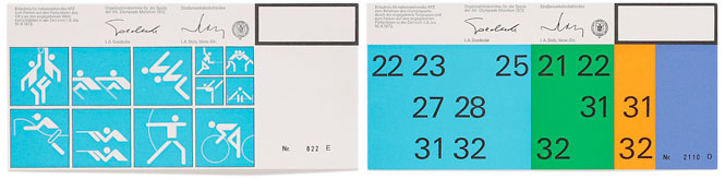
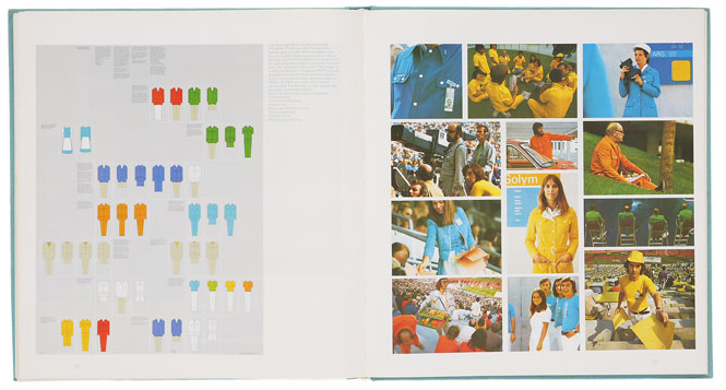
Both images show parking permits. Until the Mexico Games, design was largely at the discretion of the designers, but from this event onwards, unified design principles were applied even to aspects invisible to the general public. Furthermore, as seen in this photograph, designs were differentiated for event staff, athletes, and general spectators.
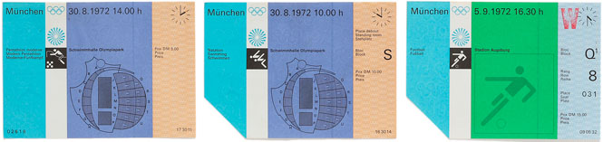
Admission tickets for events at the Munich Games. The bottom left corner is designed to be torn off as a stub upon entry. Although the text is in three languages, the use of a grid system ensures a clean and organized appearance.
Otl Aicher's Aesthetic Sensibility, Imbued in Every Detail
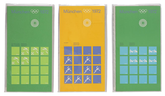
The design of the Munich Olympics is also referred to as the "pinnacle of design." The official manual for the Games is truly a "perfectly realized document."
Previous Games had merely simplified symbols for events, but the pictograms for the Munich Olympics were organized with strict rules regarding straight lines, circles, and angles of 45 degrees, as well as horizontal and vertical orientations. The color palette was limited, and everything was symbolized. The typeface is also unified, using the font 'Univers.' Posters, ID cards, medical information, parking permits, and even manuals for Munich Airport during the Olympics were produced. Design unification extended to areas unrelated to the competitions. This was also the first Games to use German, English, and French. The event also introduced its first mascot: a dachshund named "Waldi."
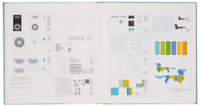
The Munich Olympics manual. It meticulously details standards for logo and text usage, as well as color schemes. The dachshund depicted here is "Waldi," the Games' mascot. The uniforms for venue staff also used color-coding to distinguish different roles.
By the time of the Munich Olympics, modern design had already begun to decline. Ethnic tensions, suppressed by modernist society, began to surface, culminating in the tragic murder of Israeli athletes by terrorists during the Games. Following this, the Olympics became increasingly intertwined with social unrest and entered a period of decline. The subsequent Montreal Games were a major failure, with Canadian citizens still paying off the debt incurred. The Moscow Olympics saw a boycott by Western nations, forcing the IOC (International Olympic Committee) to confront a crossroads regarding the future of the Olympics: should they be cultural events or profit-driven platforms for international exchange? Ultimately, the IOC chose the path of business. The Los Angeles Olympics, with its focus on broadcast rights and official sponsors, adopted a "client-first" approach, prioritizing agencies that profited from the Games. This resulted in immense commercial success. From this point onward, the cultural aspect, where designers from host nations once vied for excellence, began to wane.
Even after the decline of modern design, outstanding designs like the Munich Olympics pictograms continued to be used. However, in recent years, a global movement to respect ethnic cultures has gained momentum, and this is increasingly reflected in Olympic design. For instance, the pictograms for the Sydney Olympics incorporated the touch of the indigenous Aboriginal people, and the recent Beijing Olympics featured pictograms inspired by ancient Chinese script. Amidst the strong emphasis on commercial events, new design consciousness is emerging. For the upcoming London Olympics, Tyler Brûlé, the founder of magazines like Wallpaper and Monocle, has been appointed for graphic design, suggesting a resurgence of design perspectives.
And now, in 2016, the Olympics may be held in Tokyo, the very place that catalyzed the establishment of "design" in 1960. In the sense of being a "starting point for design," I sincerely hope that the Olympics will once again become a "showcase for cultural design."