Part 10: The Olympics Through the Lens of Design - Part 2
The 10th Olympic Games Through Design: Part Two
In this special installment of "Seeing the Olympics Through Design," we introduce the Mexico City Games. We delve into the work of Lance Wyman, who was appointed lead designer in his twenties, and explore the cultural backdrop of Mexico at the time. Please enjoy graphic works that are now considered exceptionally rare.
Interviewer & Editor: Takeshi Takahashi, Masaki TakeiPhoto by Jamandfix
The 1968 Mexico City Olympics were an evolution from the Tokyo Games. As Mexico was a developing nation at the time, there was an intention to showcase Mexican culture. The visuals reveal the adoption of colors and patterns that symbolized this. The producer was Pedro Ramírez Vázquez. The logo design was handled by American designer Lance Wyman, who was appointed lead designer in his twenties.
He had previously worked at "George Nelson Associates," the firm of George Nelson, a representative designer of the mid-century. During the Cold War in the 1960s, George Nelson Associates was commissioned by a government agency to edit a propaganda magazine. This publication showcased the advancements of American industry, entirely in Russian. It is said that during this period, Lance Wyman, as a staff member, built connections with internationally significant figures...
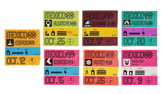
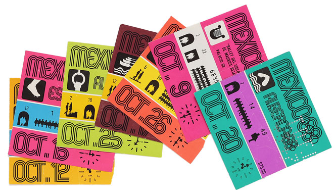
Event tickets for the Mexico City Olympics. Designed by Lance Wyman. A notable feature is the section indicating seating. While seat numbers are usually shown with digits alone, the Mexico City Olympics used illustrations to represent gate and row numbers, such as "Gate 00, Row 00, Seat 00."
Establishing Visual Recognition: Vibrant Design Work
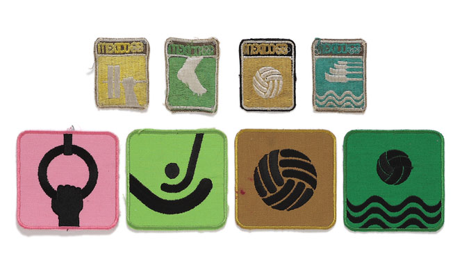
At the time of the Mexico City Olympics, literacy rates were low due to inadequate education, with a vast majority being illiterate. To ensure that the Olympics were visually recognized by these people, the graphics for the event were almost entirely expressed visually. Mexico, with its ancient cultures like the Maya that used hieroglyphs, excelled at visual recognition. In a sense, their graphic design was advanced. The striped pattern used in the logo also has meaning. There was a native Mexican tribe called the Huichol, who had an art form where they would weave threads to create patterns while under the influence of magic mushrooms, experiencing hallucinations. This appears to be the source of the striped pattern. 1968 was the psychedelic era, a time when Op Art was popular, and this successfully fused ethnic traditions with the trends of the time.
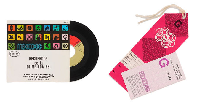
An official record of the live broadcast of the Mexico City Olympics, released shortly after the event (left), along with a parking pass used during the Games (bottom right) and a press ID card (top right). Starting around the Tokyo Olympics, design began to permeate these non-competition aspects, particularly the graphics for internal event operations.
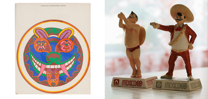
A promotional book compiled by Italian company Olivetti, a sponsor of the Games (left). The design was by Milton Glaser, a founding member of the American illustration collective Push Pin Studios. A ceramic figurine sold as an official souvenir of the Games (right). While adhering to modern design principles, it also possessed a playful spirit.
The era was marked by global upheaval, including the May 1968 protests in Paris and student movements in Japan. In design, the "Postmodern Declaration" was made in France in 1968. This represented a rebellion against the prevailing "modern" aesthetic. The rejection of bourgeois values and the destruction of religious icons began to surface. Questions arose worldwide about whether cultural destruction was permissible in the pursuit of an egalitarian society. Suppressed frustrations led to an outpouring of discontent, which would influence the 1972 Munich Olympics.