An OPENERS Editor’s Candid Thoughts on Trying on the ‘Hermès H08’ on Their Wrist | HERMÈS
HERMÈS | Hermès
The Ideal Watch for the Digital Age: HANDS ON with the Hermès H08
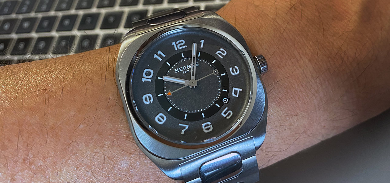
Among the many major brands participating in “Watches & Wonders 2021,” this model left a strong impression on me. Its design philosophy felt overwhelmingly new, unlike anything that had come before. I love watches. In that sense, I adore the heritage look of the mechanical watch era. But the appeal of watches must be more than that. Hermès’s latest creation, the “Hermès H08,” possesses a smart, light edge that is thoroughly focused on the present moment.
Text & Edit by TSUCHIDA Takashi
A Face Design You'll Want to Revisit, and an Unparalleled Lightness on the Wrist
Just as we have smartphones around us and notebooks on our desks, the design code of the “Hermès H08” embodies the reality of “now.” The proof is in its compatibility with digital wardrobes, rivaling even the Apple Watch. Yet, it possesses a sense of quality that smartwatches lack.
From a practical standpoint, nothing beats a smartwatch (battery life aside). Still, I want to wear a mechanical watch on my wrist. I want to wear a mechanical watch for important occasions. The reasons vary—as a fashion statement, as a personal talisman to inspire myself—but I feel a sense of elevation from a meticulously crafted luxury watch, an emotion not easily evoked by a smartwatch with its uniform, almost prescriptive, form.
※Of course, I wear smartwatches too. Mechanical watches and smartwatches are not meant to be compared in the first place.
Wristwatches of the 20th century consistently embodied function. That is, every shape had a reason, directly linked to achieving its purpose. For example, the popularity of the cushion case in the 1930s was driven by the need for increased durability and shock resistance. Cases had to be enlarged to protect the internal mechanism from shocks, dust, and water ingress. This was also to make watches accessible to more citizens for daily use, not just for special occasions for the wealthy.
However, with modern technology, special shapes are no longer necessary to achieve everyday durability and shock resistance. Function no longer dictates design. So, what does the square shape of the “Hermès H08” signify?
I surmise that the design was conceived by working backward from the lifestyle it's intended for. In other words, it’s an approach from the opposite direction of traditional watch design.
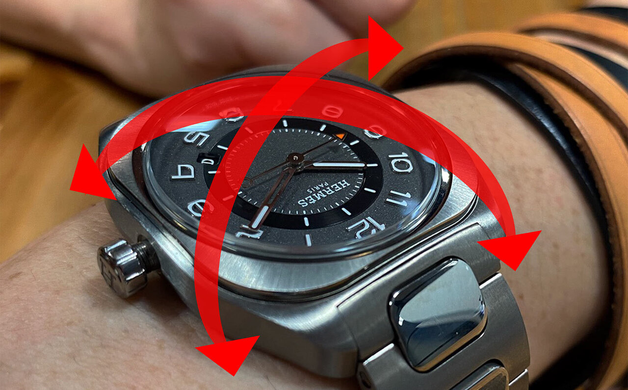
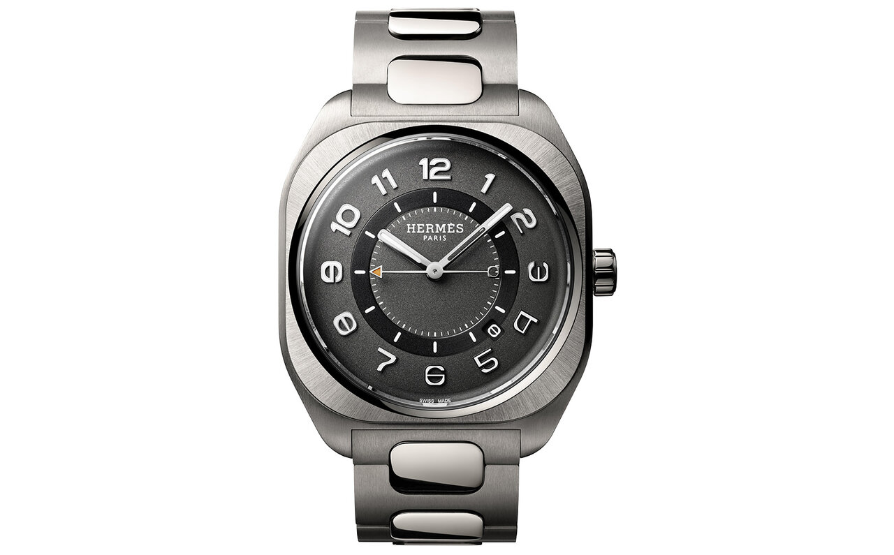
Observing the new model again from this perspective, one can discern layers of design ingenuity, much like the layers in French cuisine. It’s not merely a combination of square and round; the frequent use of concave and convex surfaces creates complexity, conveying a density achieved through modern design techniques. The more I look, the more I am drawn into the details.
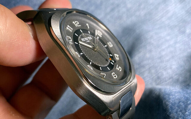
The bezel is a softened square. However, it’s beveled at 45-degree angles, lending a sense of dynamism to the case shape.
The beauty lies in its naturalness, deliberately avoiding emphasis on complexity for a simple, sporty first impression. It’s not a simple argument of “square is good” or “round is traditional.” While appearing sporty at first glance, its dense design elements prevent it from becoming tiresome. I believe this form emerged from pursuing such design quality.
The rounded square corners create a soft impression, echoing the contemporary atmosphere that blurs gender lines. While smartwatches are neither male nor female, I believe Hermès has introduced this concept to the world of luxury watches with this model.
Incidentally, Hermès was also the first luxury maison to embrace the Apple Watch. Hermès has a history of foresight, adapting to changing times from a horse-drawn carriage society to an automotive one. By leveraging their expertise in saddlery, they created products for the era's needs, such as travel bags and accessories for women. This same vision is evident in the craftsmanship of the “Hermès H08,” which makes perfect sense.
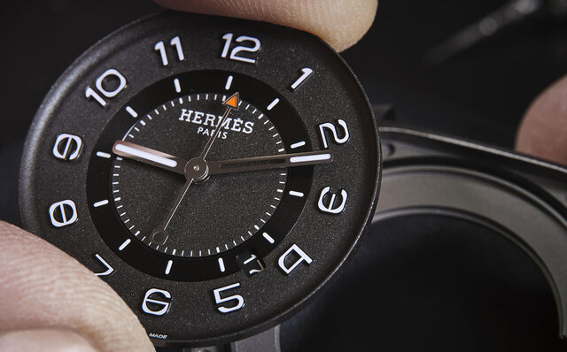
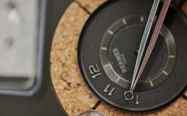
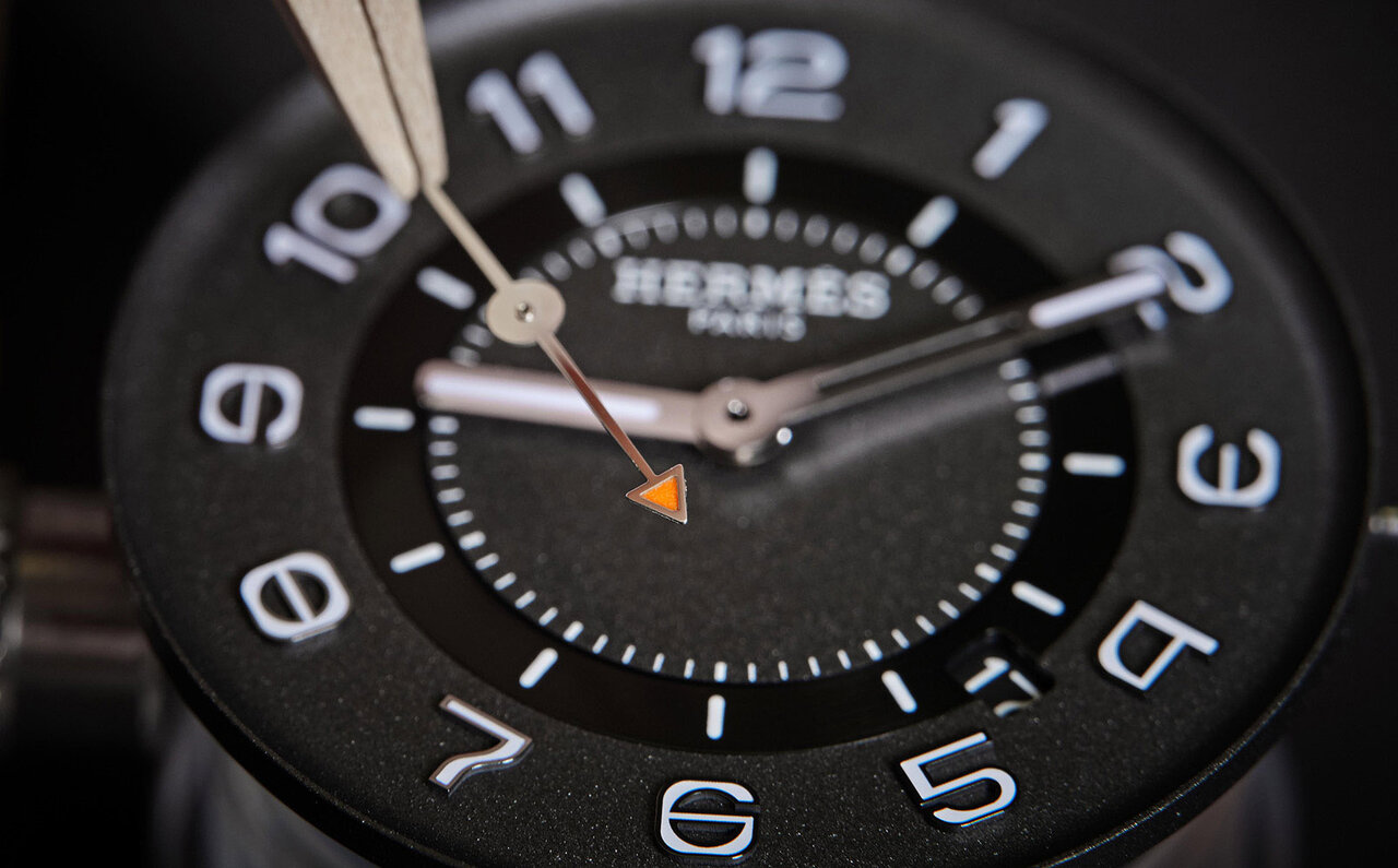
Let’s turn our attention to the dial. What immediately catches the eye is the distinctive font of the numeral indices. The rounded font design imparts a genderless impression and resonates with the case’s form. Hermès designs new numeral indices for each new creation; if the dial is the face of the watch, then the numeral indices are its features. The creativity involved in consistently designing new, distinctive indices is astounding. It’s precisely the same attitude as Hermès’s iconic ‘Carré’ scarves, with new designs created each season. I believe Hermès should promote this fact more vocally, but perhaps that is simply Hermès’s characteristic modesty.
And then there’s the intriguing detail of the second hand, which is normally the longest, being the shortest. However, with the second indices placed inside the hour markers, the passage of time indicated by the second hand can still be read precisely. It’s a smart design that doesn’t waste the mainspring’s torque, much like a nimble European compact car running with a small engine. Power is needed to move the second hand. This design conserves that power without waste, while also preserving the measurement function. Indeed, it is thoughtfully conceived.
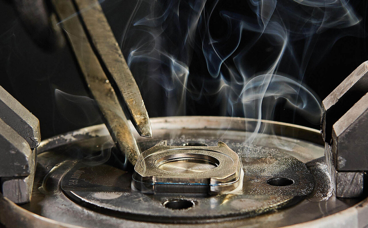
The titanium material is repeatedly hot-forged to achieve its finish. It has an extremely sharp, modern industrial aesthetic.
Moreover, wearing it on the wrist, I’m struck by its lightness. Titanium cases (or graphene composite material in some models) are overwhelmingly lighter than stainless steel or gold, preventing wrist fatigue. It eliminates those moments where you take off your watch after wearing it all day to rotate your wrist – a gesture that looks rather awkward to onlookers.
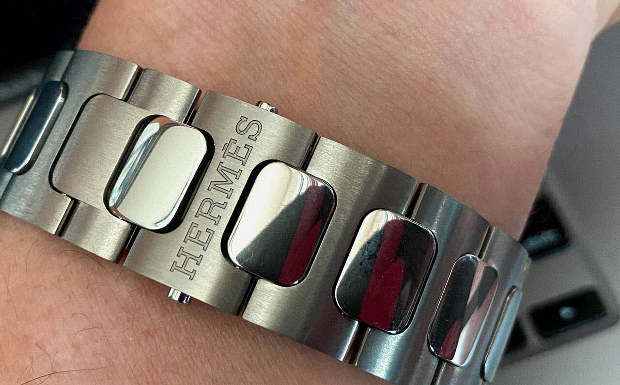
A bracelet that fits the wrist with supple grace. Each link is shaped like the letter 'H'.
The phrase “fashion is suffering” is irrelevant to this item. The grayish tone of titanium pairs exceptionally well with smartphones and notebooks. Furthermore, upon closer inspection, each component of the bracelet subtly resembles Hermès’s initial, ‘H.’ While titanium bracelets typically have sharp edges to mask processing difficulty, the supple, rounded finish here, as if working with soft, easily malleable gold, conveys immense pride.
Furthermore, it’s equipped with a manufacture movement and offered at a price that can be considered exceptional for a top-tier maison! Including its overall package, this item shines brightest for me among the many new releases of 2021, like a star.