FASHION /
WOMEN
April 23, 2015
The "Semoh" Collection: Inspired by the Natural Imagery of Deserts and Oases in Material and Color
TOKYO Men's Brands Feature | semoh
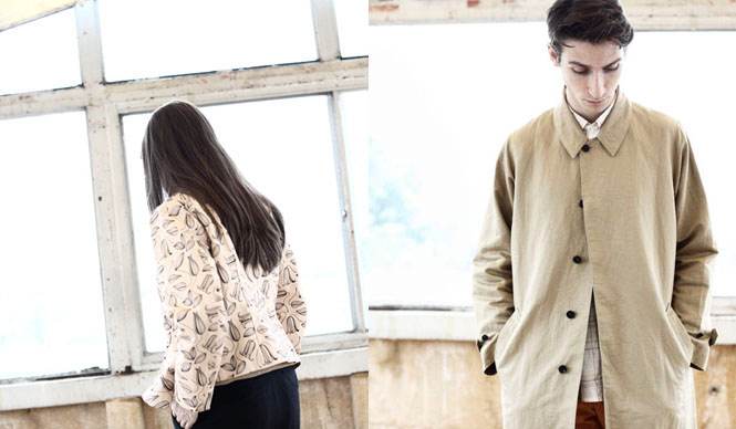
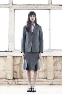
semoh 2015 Spring/Summer Collection
A Collection Reflecting Nature's Desert and Oasis Imagery in Materials and Colors
The brand name “semoh” is an anagram of the English word for home, “homes.” This season, in a departure from the concept of the 2014 Spring/Summer collection, it imagines the relationship between the home (building) and nature, such as deserts and oases (water), which lie beyond the exterior. Designer Hiroyuki Ueyama’s concept of “a sense of liberation like being at home and a sense of tension like being outdoors” is expressed in the styling.
Text by KAJII Makoto (OPENERS)
Conscious of Things That Make You Feel Your Own Powerlessness
──What were the points you focused on for this season's lookbook shoot, and what should people pay attention to?
We had planned to shoot in a forest, but due to an unexpected typhoon, it was suddenly moved indoors. I think the atmosphere of the staff who created this together, and the sudden change in circumstances, came through. There's also a video on the semoh website, so I'd be happy if you could take a look at that as well.
──What are the differences in styling, silhouette, and color compared to last year's Spring/Summer collection?
For the 2014 Spring/Summer season, I was conscious of the inside and outside of buildings, and the inside and outside of living environments. This season, I imagined a more natural relationship, like that between a desert and water. Perhaps it was the typhoon on the day of the shoot, but I feel I was conscious of things that make one feel their own powerlessness.
──What is the key look (coordination) for this season?
There isn't a specific key look. I hope people will appreciate the overall atmosphere.
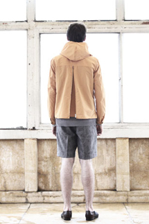
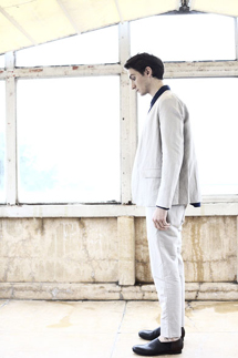
This Season's Must-Have Item: Leather Shoes
──What are the key items and key colors?
There are no particular key items or key looks for the same reason as before. However, we did produce leather shoes this season. As for key colors, I would say the orange dyed with eucalyptus, the light blue, and the indigo blue dyed with litmus, continuing from last year.
──What "materials" did you focus on this season?
Perhaps the dry cotton yarn used for the summer knit.
──What supports the brand's creativity?
People. Close friends, people involved with the brand, and those who wear our clothes.
semoh
Tel. 03-3780-3998
http://semoh.byhiroyukiueyama.com