“ISETAN LIVING×HIROCOLEDGE” BED│Bold circles and straight lines that resonate with the spirit
ISETAN LIVING×HIROCOLEDGE
BED│Bold Circles and Straight Lines That Resonate
For the third installment of "ISETAN LIVING×HIROCOLEDGE," Hiroshi Hashimoto, buyer for Isetan Living's bedding and bed goods, introduces items that will make time spent in the bedroom more enjoyable.
Portrait by Shiori KawamotoText by Hiroshi Hashimoto, Bedding & Bed Goods, Isetan Living Sales Department
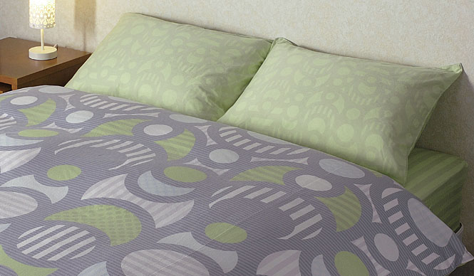
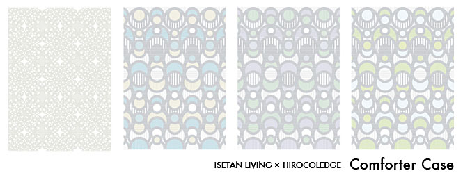
Coordinated Designs and Colors Across Items
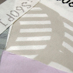
Utilizing inkjet printing by a domestic manufacturer with cutting-edge printing technology, highly regarded worldwide, we have achieved sharp lines and vibrant colors.
Texture is paramount. To achieve a soft feel, the fabric, made from ultra-long staple Indian cotton, undergoes a slight brushing process after printing. The gentle color palette is further enhanced by the material's texture.
Each item's design and color scheme are coordinated, allowing customers to enjoy a variety of arrangements.
The Bedroom: A Space for Ultimate Self-Expression
—What are your impressions of Ms. Riko Kashiwagi's work?
I believe the value of Riko Kashiwagi's designs lies in her meticulous craftsmanship, which considers both the creator and the customer.
Though composed solely of circles and straight lines, the bold patterns lend an impact and added value not found in existing products.
I consider the bedroom to be the space where one can be most oneself. Designs that are a joy to behold, that liberate the mind. Designs that resonate with one's "feelings."

Hiroshi Hashimoto
—Regarding the "ISETAN LIVING×HIROCOLEDGE" project
This "ISETAN LIVING×HIROCOLEDGE" is an "Only I" project that spans across categories. However, I believe we should naturally be proposing ideas that transcend categories.
This initiative represents a new proposal, a challenge unlike any before.
We, as buyers, are committed to continuously working together to offer proposals that enrich our customers' lives.
—Sales begin on Wednesday, March 4th.
Riko Kashiwagi's sincere approach to her work was inspiring, and I thoroughly enjoyed this project.
I believe the resulting products possess high design and quality value.
It would be my greatest joy if customers feel that using these products makes their time in the bedroom more enjoyable and enriches their lives.
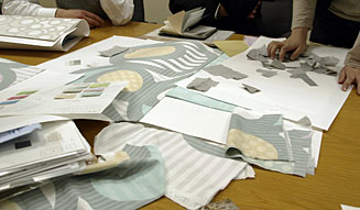
The key was how to best utilize the largest design area among the items I worked on for this project.
Typically, for items like comforter covers, to accommodate sizes from single to king, many small, organic patterns are used, allowing fabric pieces to be joined without concern for pattern matching.
However, wanting to express my signature boldness, I attempted to maximize the pattern's expression within the constraints of pattern matching.
Inkjet printing made this possible. The ability to render such large patterns, and the multi-color use that would require numerous screens in silk-screening, were achievable thanks to inkjet printing.
Furthermore, considering the large area the design occupies and its proximity during sleep, I opted for gentle tones.
